Skip to content



LATEST IN ARTICLES

Logo Design
Brand Positioning
What is Brand Strategy? How can small business do it?
Logo Design
Brand Positioning
Top ten branding agencies winning globally
FOLLOW US
Defining PUFS: Puducherry’s First Facility Management Service
INDUSTRY
Hospitality
CLIENT
Pick Ur Facility Service
LOCATION
INDIA
SERVICES OFFERED
Brand positioning
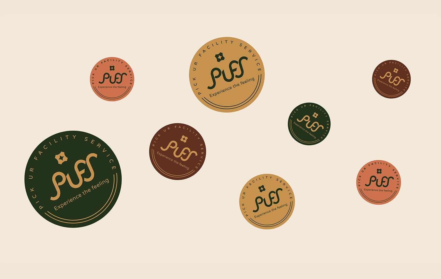
Logo design
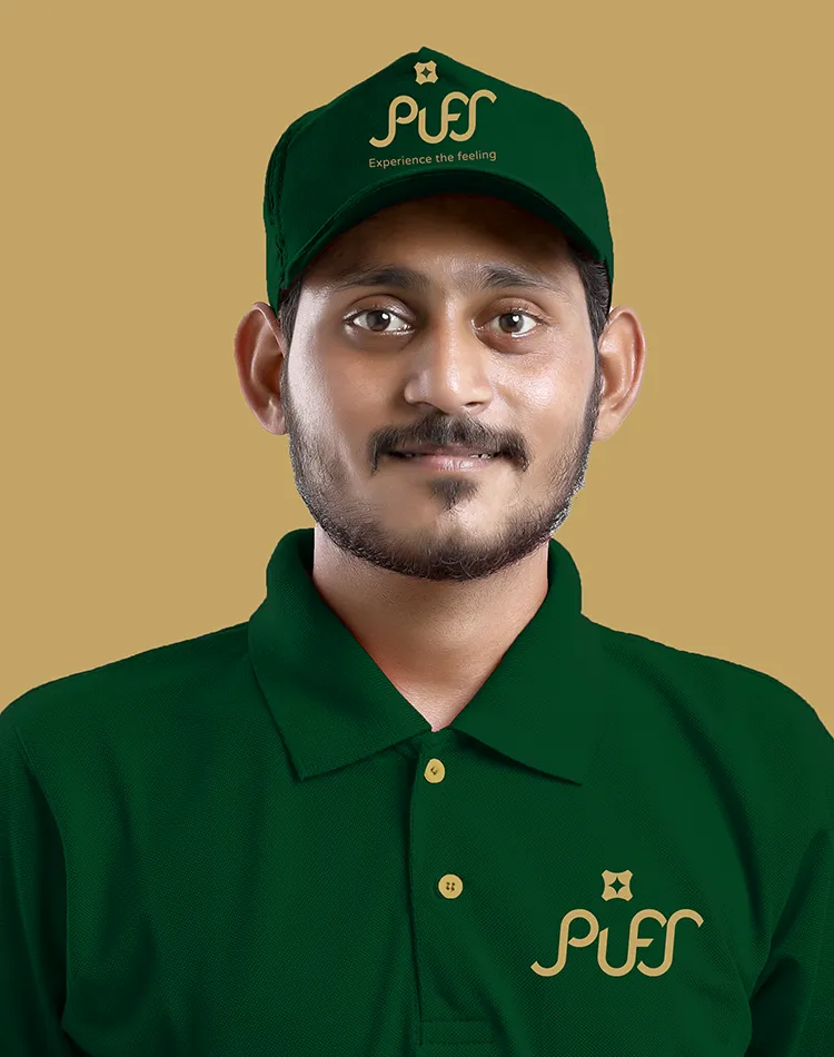
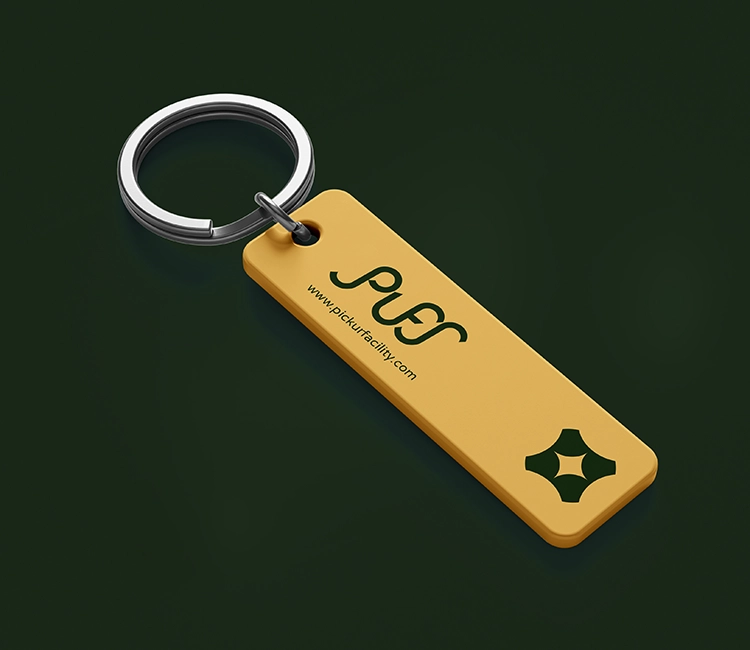
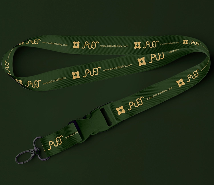
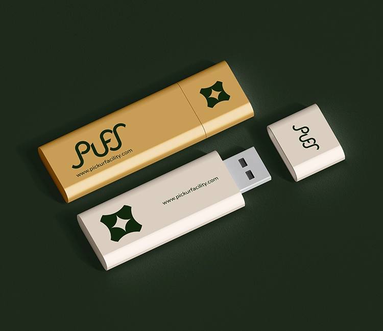
Brand collaterals Uniform & merchandise
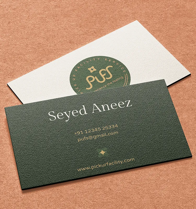
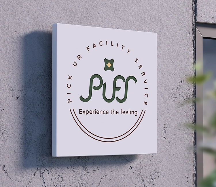
Corporate identity
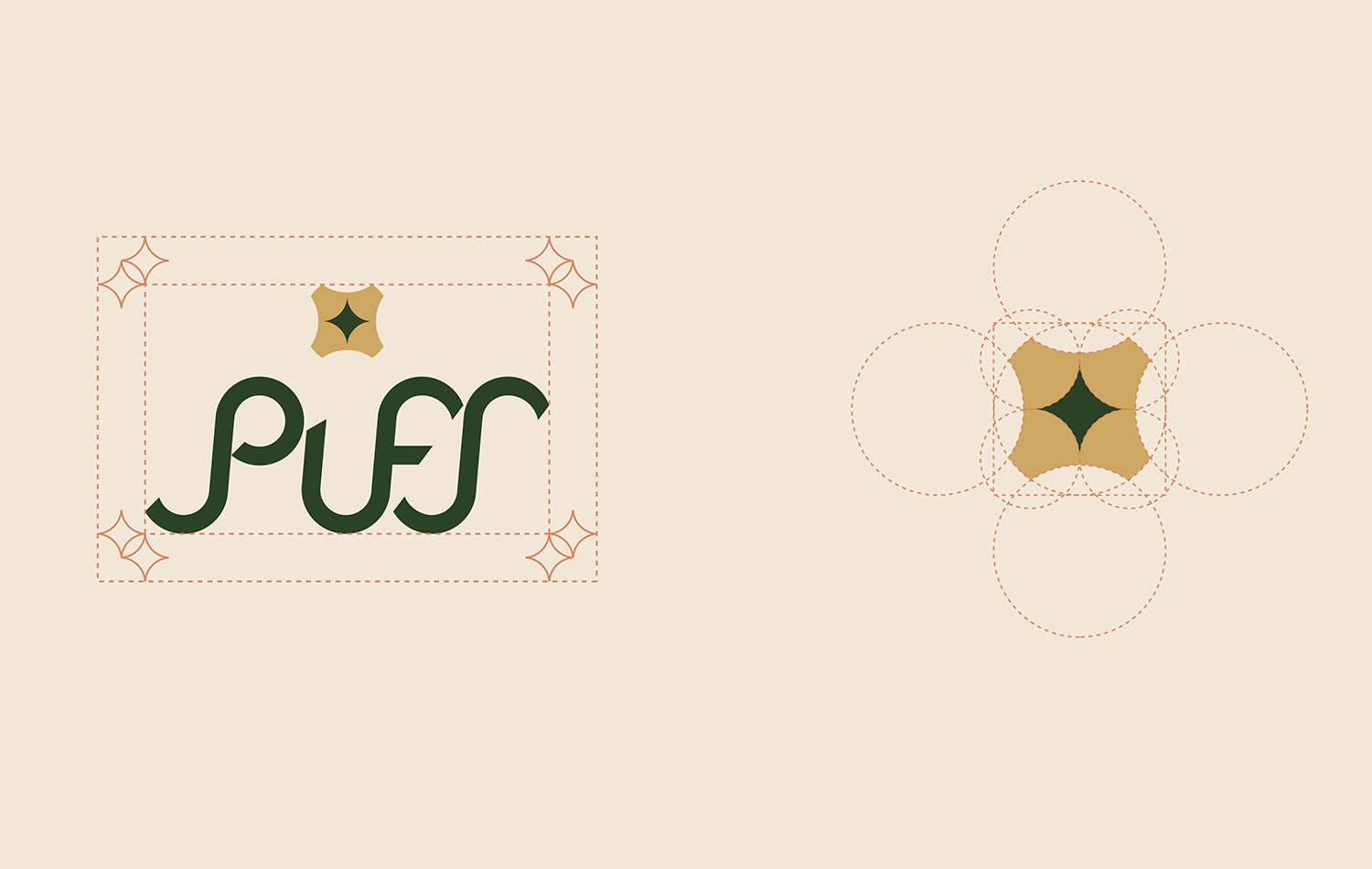
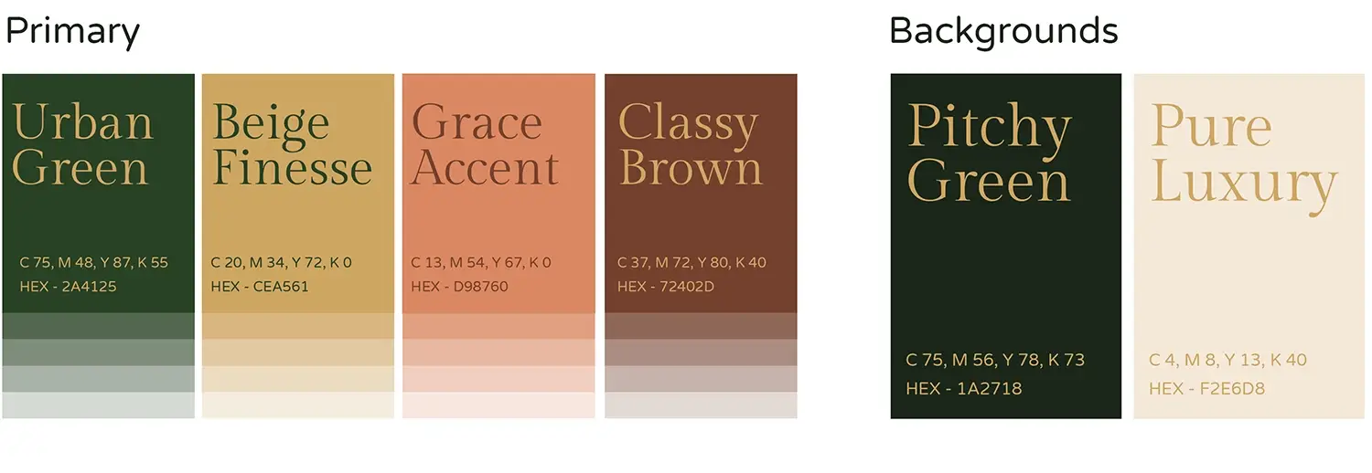
Brand design system
Logo design
Brand collaterals Uniform & merchandise
Corporate identity
Brand design system
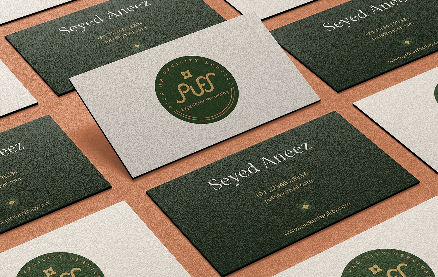
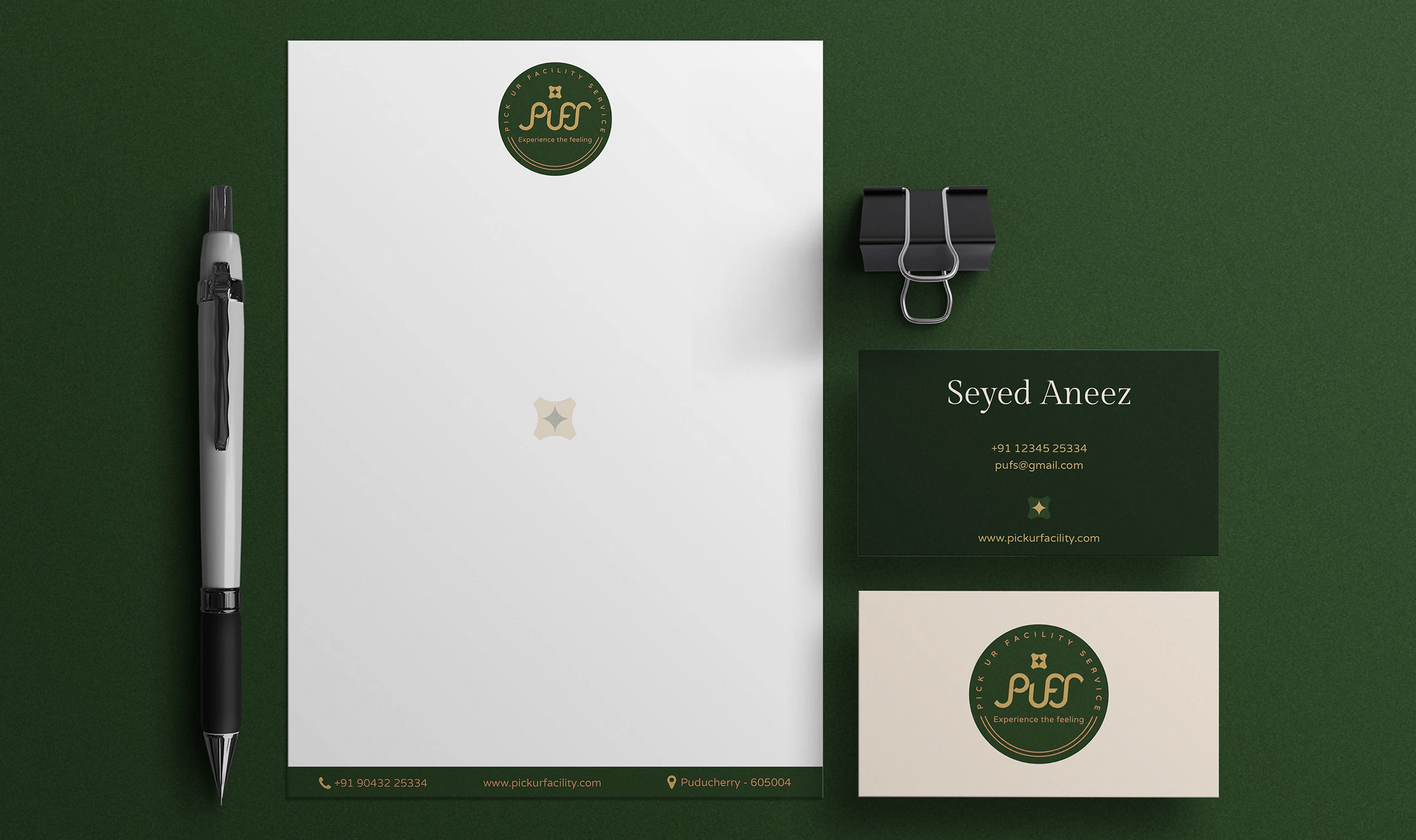
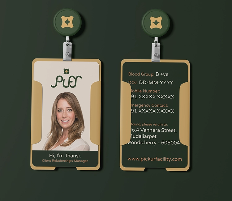
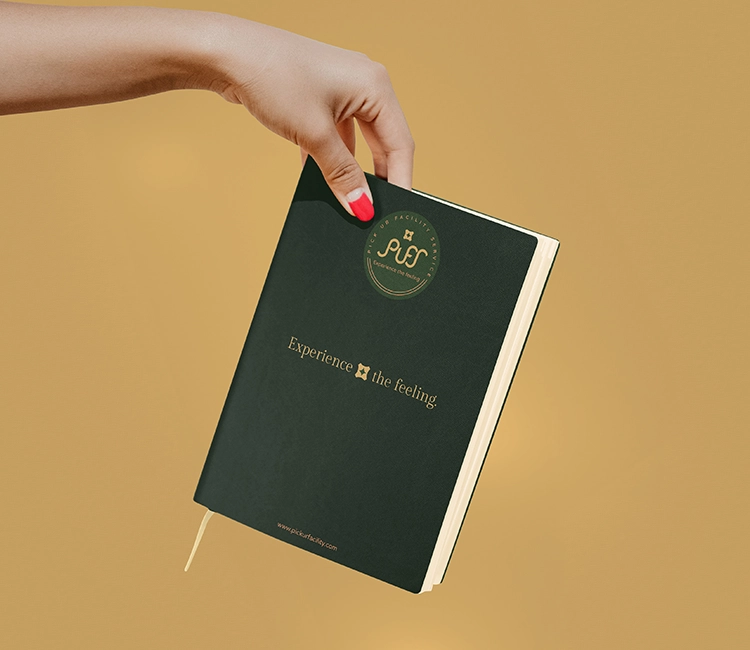
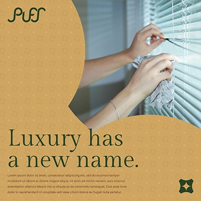
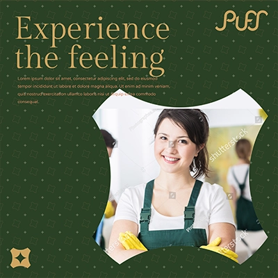
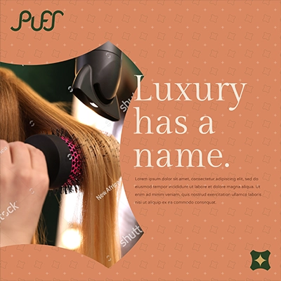
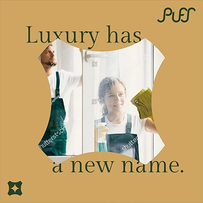
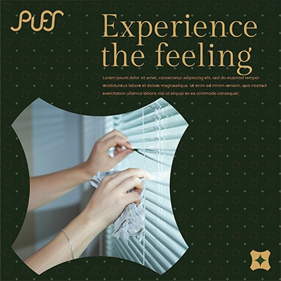
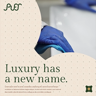
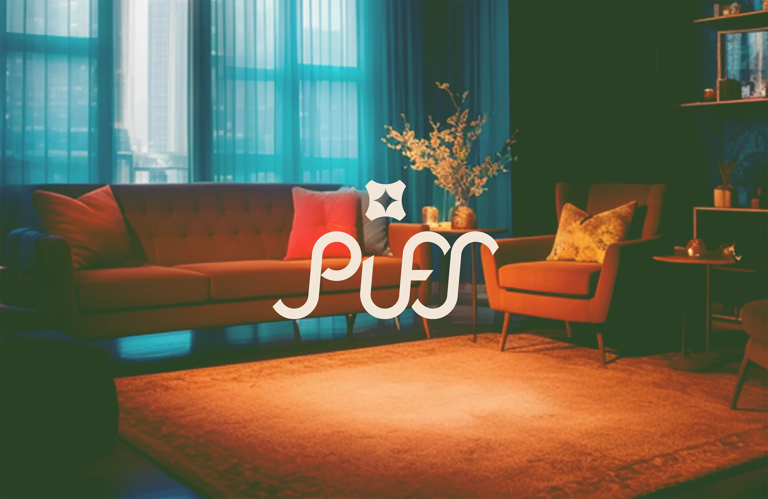
PUFS, Pick Ur Facility Service, launched in Puducherry, India with a clear vision: to redefine facility management through innovation, premium service, and advanced technology. From the first click to the final service touchpoint, PUFS delivers a seamless, luxurious experience that transforms mundane maintenance into exceptional care.
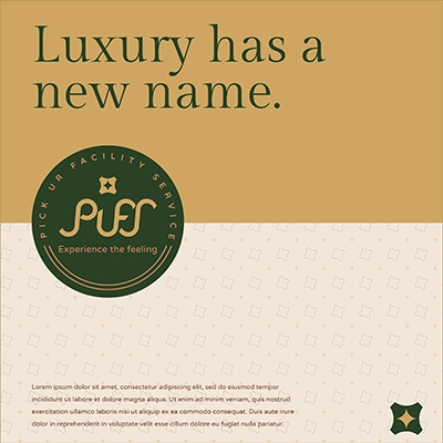
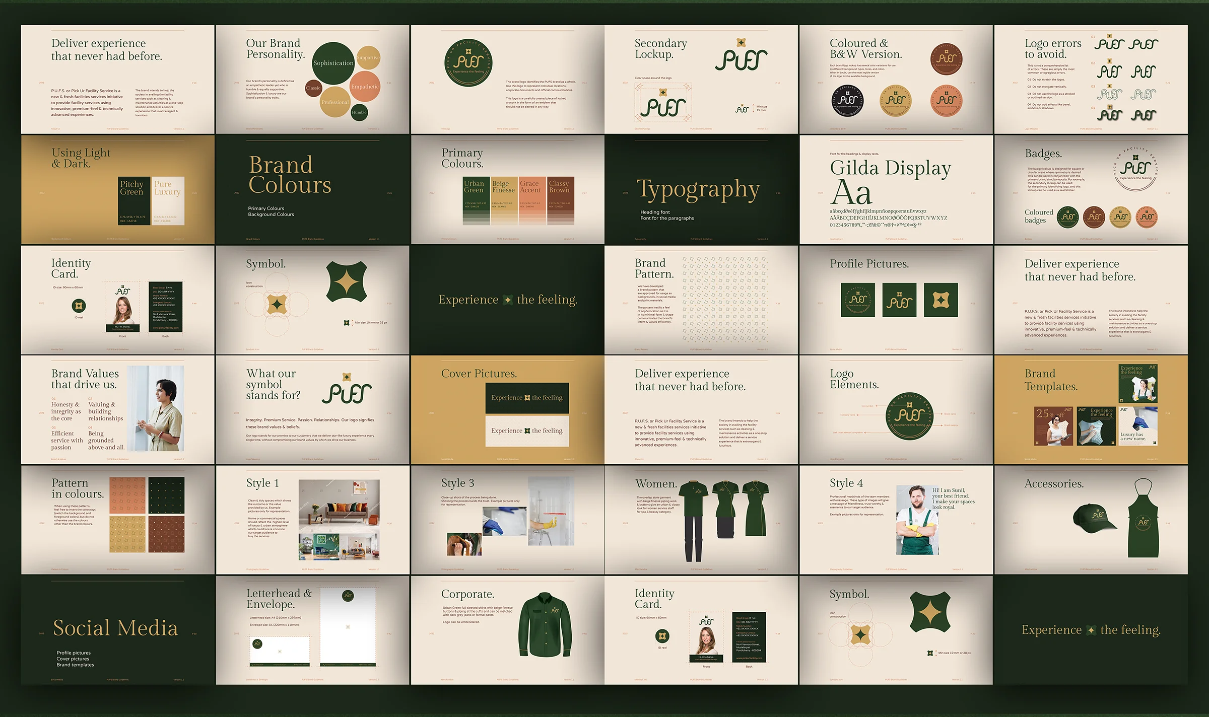
The founder of PUFS approached us to craft a unique brand identity and positioning that would help to create a hype in the market, instill trust and credibility, and give the brand a professional and premium aura.
The founder of PUFS approached us to craft a unique brand identity and positioning that would help to create a hype in the market, instill trust and credibility, and give the brand a professional and premium aura.
PUFS, Pick Ur Facility Service, launched in Puducherry, India with a clear vision: to redefine facility management through innovation, premium service, and advanced technology. From the first click to the final service touchpoint, PUFS delivers a seamless, luxurious experience that transforms mundane maintenance into exceptional care.
The founder of PUFS approached us to craft a unique brand identity and positioning that would help to create a hype in the market, instill trust and credibility, and give the brand a professional and premium aura.
The founder of PUFS approached us to craft a unique brand identity and positioning that would help to create a hype in the market, instill trust and credibility, and give the brand a professional and premium aura.